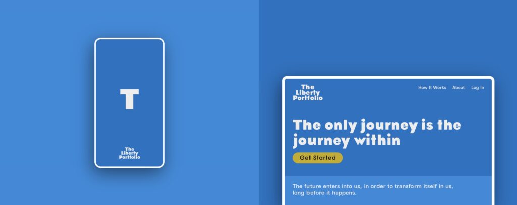
Welcome to The Liberty Portfolio’s branding page. Here, you’ll find comprehensive guidelines that define our visual and communicative identity. Our branding is more than just aesthetics; it reflects our commitment to providing clear, accessible, and trustworthy financial information. Below are details on our color palettes, usage guidelines, and the philosophy behind our choices.

Our Philosophy
Our brand identity is designed to convey trust, clarity, and professionalism. Our chosen colors and styles reflect our dedication to providing an informative yet user-friendly experience. We aim to instill confidence among our users that they receive reliable and valuable information that can empower their financial decisions.
Our Color Palette

Primary Palette
- Primary (#0771c3): This deep, vibrant blue symbolizes trust, dependability, and professionalism.
- Tint 1 (#208adc): Slightly lighter than our primary blue, used for hover states and highlights.
- Tint 2 (#3aa4f6): A bright blue that adds a refreshing pop of color to interactive elements.
- Tint 3 (#53bdff): The lightest blue, ideal for backgrounds and gradient fills.
Secondary Palette
- Secondary (#ededed): A subtle gray used primarily for backgrounds to reduce strain on the eyes and enhance readability.
- Tint 1 (#ffffff): Pure white, used for backgrounds and in typography to create contrast with darker colors.
- Tint 2 (#ffffff): Identical to Tint 1, ensures uniformity and cleanliness in design.
- Tint 3 (#ffffff): Also identical to Tint 1, used interchangeably to maintain a clean and uncluttered look.
Tertiary Palette
- Tertiary (#c5ac07): A golden yellow that signifies warmth, optimism, and the value of our insights.
- Tint 1 (#ebd22d): A lighter shade of yellow used for highlights and accents that require attention without overwhelming.
- Tint 2 (#f8df3a): Even lighter, good for small accents and to draw attention subtly.
- Tint 3 (#fff853): The lightest yellow, providing a soft glow to visuals.
Gray Palette
- Gray 1 (#181919): Almost black, used for text and important typographic elements to ensure excellent readability.
- Gray 2 (#56595b): Medium gray, ideal for secondary text and supportive details.
- Gray 3 (#b1b1b1): Light gray used for borders and subtle dividers in layout design.
- Gray 4 (#e4e4e4): Very light gray, primarily used for background sections to break up content without high contrast.


Usage Guidelines
Logo
Our logo should always be used on a clean and unobtrusive background to maintain its integrity and visibility. The primary logo color is our Primary Blue (#0771c3), but it may be adapted in white (#ffffff) on dark backgrounds.

Typography
We use a combination of serif for headings to convey authority and sans-serif for body text to ensure readability. The text should primarily be in Gray 1 (#181919) to contrast sharply against lighter backgrounds.
Imagery
Images used should reflect diversity and inclusivity, focusing on professional settings. They should be high-quality and relevant to the content they accompany.

Digital and Print Materials
For digital use, ensure that colors are web-safe and accessible. For print, refer to CMYK equivalents to maintain color fidelity.
Our branding guidelines are crafted to ensure consistency and coherence across all our communications. Adhering to these guidelines will help maintain The Liberty Portfolio’s professional image and reinforce our commitment to quality and trustworthiness in all our interactions.


